Uniqlo Website Unmoderated Remote Usability Testing
Overview
A team of four usability experts conducted unmoderated remote usability tests for the Uniqlo website to identify usability issues and design opportunities. The usability experts collaboratively created a scenario, a set of tasks, and a post-task questionnaire for the usability test. UserTesting.com was used to get remote access to users.
Purpose
Unmoderated Remote Usability Testing of a website
My Role
Research
Scripting
Storytelling
Mockup building
Tools
Usertesting.com
Figma
Project Type
Graduate Usability Theory Course Project
Team
Victor Chien, Fariah Qasim, Qin Shi, Yuki Shimano (Me)
Period
Oct 2020
The Website
Uniqlo is a global clothing retailer that offers good quality and affordable everyday clothing to customers throughout the world, through their physical and online stores located worldwide. To respond immediately to the customer’s requirements and needs, Uniqlo has digitized its supply chain to transform into a Digital Consumer Retail Company. Uniqlo realizes that the e-commerce services stimulate customers to purchase items from physical stores more often.
The Challenge
As online shopping has become more prevalent due to the covid-19 situation, Uniqlo has to run its website successfully than ever before. However, each member of the research team felt that the user experience of the current Uniqlo website was not perfect when they personally browsed it to purchase clothes in the past.
Goals
Uncover usability issues, propose solutions to them, and communicate the solutions in a written report.
My Role
The team designed the unmoderated remote usability tests on UserTesting.com, including defining the tasks, recruiting test participants, and conducting the tests. I analyzed video recordings of 3 participants (remaining 9 were analyzed by teammates), conducted team meetings to combine all data points, identified usability problems of the Uniqlo website, and proposed recommendations. In creating the final report, I was in charge of describing the findings and suggestions related to searchability and documentation. I also designed mock-ups to communicate the solutions visually.
Methodology
For this project, a 12-participant Unmoderated Remote Usability Testing using the UserTesting.com platform was chosen to allow for quick and easy recruitment of target users, and get their feedback along with video recordings.
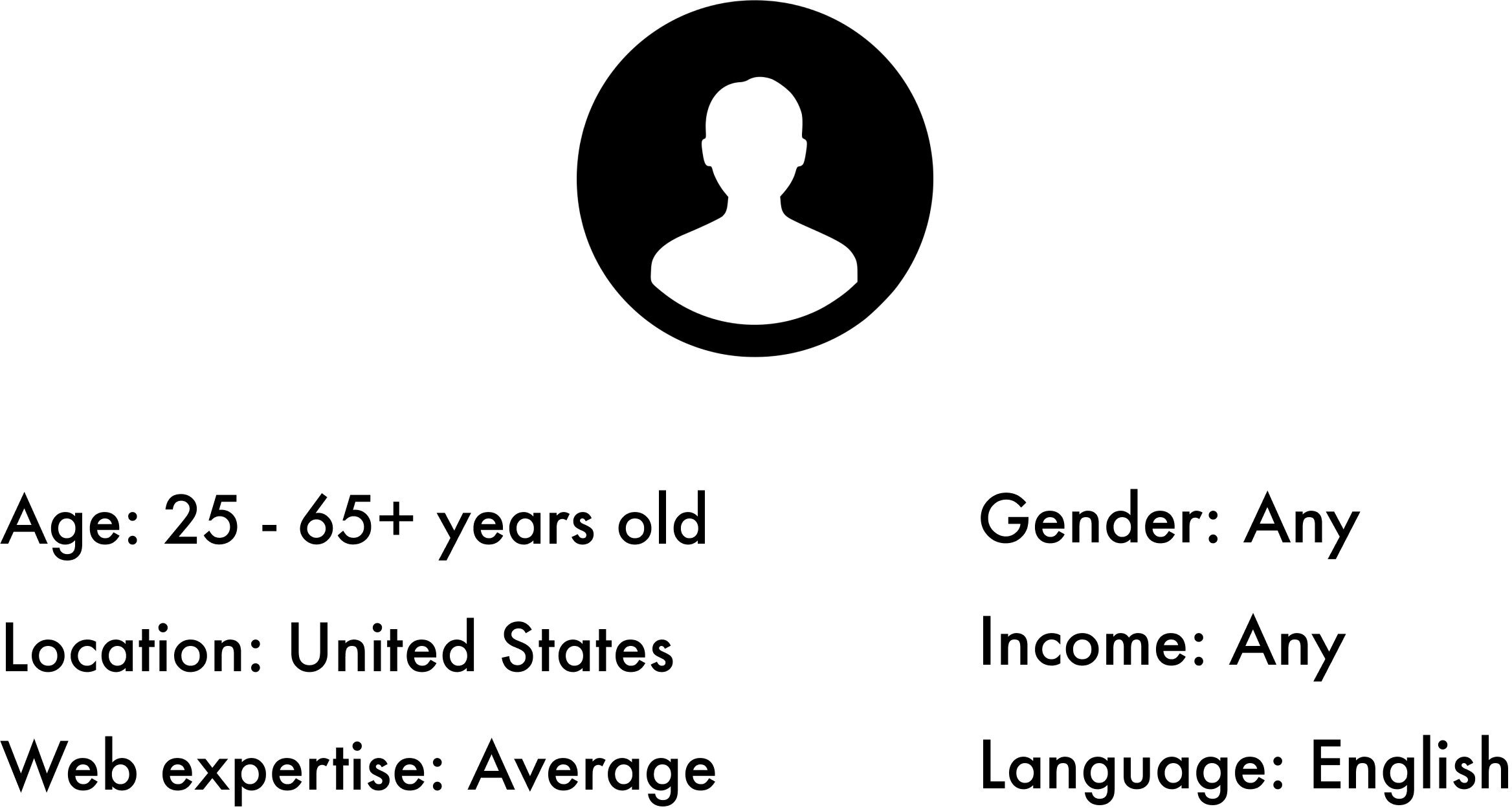
Target Users
Uniqlo targets male and female customers who are looking for affordable and high-quality clothing that fits their lifestyle. With this in consideration, the target participants for the research were set to:
Scenario and Tasks
The test scenario and tasks laid out for the study were as follows:
You are shopping for winter clothing on the Uniqlo website.
Buy a black sweater from the Stay At Home collection.
Use the MySize Assist to find your size.
Find a complete look that you like from the Lookbook (Uniqlo U) and add the exact same pieces of clothing the model is wearing to your bag.
Find out if Uniqlo offers free returns.
Post-Test Questionnaire
The following questions were asked after the test in order to learn more about the users’ behaviors, expectations, and experiences in summary.
What frustrated you most about this site?
If you had a magic wand, how would you improve this site?
What did you like about this site?
How likely are you to recommend this site to a friend or colleague (0=Not at all likely, and 10=Very Likely)?
Usability Testing/Data Collection
The 12 participants took the unmoderated usability test from their own laptop device. Participants were asked to speak out loud their thoughts throughout the test, and given the option to provide additional comments or feedback at the end of the test.
Screenshot of an Unmoderated Remote Usability Test video from UserTesting.com
Findings compiled on Google Sheets
Each team member analyzed 3 tests/video recordings, and recorded the usability findings into a shared chart made using Google Sheets. Observations about the participant behavior and quotes during the tasks and post-test questionnaire were compiled and consolidated.
Data Analysis
Participants were asked to rate the difficulty of each task on a scale of 1 to 5 (1=very difficult, 5=very easy).
Task difficulty ratings by participants
From the collected answers, it was found that participants had the most difficulty completing Task 3 of finding a complete look from the Uniqlo U Lookbook and add the exact same pieces of clothing the model is wearing to the cart. The median score was 3 out of 5.
Task 4 of finding if Uniqlo offers free returns was the next most difficult, with a median difficulty score of 4 out of 5.
Tasks 1 and 2 were had the median score of 5, very easy.
Findings and Recommendations
Most of the participants were able to complete the tasks but encountered issues of the navigation menu disorganization, search tool difficulties, and sizing tool discoverability. After a thorough analysis of the video recordings and post-test questions, the team came up with the following recommendations for each uncovered usability finding.
Recommendation #1: Simplify the top navigation menu
Finding 1.1: Top navigation is too complex
All of the participants had trouble looking for information through the top navigation because of its over-complexity. There were too many menus (within menus). and the labels were repetitive.
Finding 1.2: Too many options in plain texts
The long menu with plain texts made the menu look cluttered and overwhelming.
Recommendation 1.1: Reorganize the labels
Providing product type labels like Category, Collection, Collaboration, and Technology underneath customer types on the top navigation allows users to get direct access to the products, reduce clutter, and keep the label types consistent throughout the navigation menu.
Recommendation 1.2: Add images
Including images as a visual clue when users hover on a link offers decent mapping and feedback. It allows users to see the product before clicking and landing on the page to prevent mistakes.
Recommendation #2: Improve searchability and documentation
Finding 2.1: Unclear search tool results
Some participants assumed that the search tool was a universal filtering tool for looking up clothing by color and type. However, the search tool can not show filtered results perfectly. For example, searching the words “black sweater,” displayed many product images in a different color besides black. The search tool also did not tell the user what Collection each product belongs to, or provide an option to filter by Collection.
Finding 2.2: Difficult search for Return Policy information
On the Return Policy page (specifically the “Q&A about Return/Exchange” page), the list of options or articles was cluttered. When the words, “free return,” were searched using the search tool on the page, participants were presented with almost the same list of information.
Recommendation 2.1: Improve search results by adding suggested results, relevant images, and specific filtering
The search results can show the most relevant products or implement a “Did you mean” feature if words match a collection or category name. The product images should also automatically change to reflect the search words. For example, if the search tool recognizes that participants want black clothing, the product images can be set to only show black colored products. The search filter can be improved by including a Collections category for users to narrow searches by Collections, and have a different border color to stand out.
Recommendation 2.2: Emphasize and highlight keywords
The list of articles in the Returns Policy page can rephrased to a few key words and then consolidated to create more space on the page. The amount of content on lengthy article pages can be reduced, or a contents menu that will allow users to quickly go to specific areas of the document can be added. The search tool can be improved by showing results with highlighted keywords so users can instantly find what is relevant in the web page.
Recommendation #3: Standardizing the size features and improving discoverability
Finding 3.1: Confusion between the MySize Assist tool and the Size Chart
Many of the participants confused the MySize Assist tool with the Size Chart when trying to find their size.
Finding 3.2: Discoverability issues and lack of understanding with the Find Your Size link
Many participants had trouble initially locating the Find Your Size/MySize assist tool.
Recommendation 3.1: Standardizing the size features
The MySize Assist tool and Size Chart can be combined as one standardized feature to eliminate confusion between the two features and add consistency to the overall process of choosing a size.
Recommendation 3.2: Redesign the MySize Assist tool link
To help the users recognize the intended function of the MySize Assist tool, it is recommended to relabel it as ‘What’s My Size?’.
Conclusion
Disorganization of the navigation menu, search tool difficulties, and size tool discoverability were found as the critical issues that need to be addressed because of their frequency in the user tests and high likelihood of creating frustrating user experiences when using the website. If the recommendations of simplifying and reorganizing the disorganized navigation menu, clarifying the search results, and standardizing the size tools are followed, users will be able to easily navigate to the information they are looking for. The user experience will be more meaningful, eventually leading to the website’s user retention, revenue, functionality, and user engagement.
Challenges
The project faced the limitations of:
Gender poll - The gender target market was proposed by the usability experts, but it also had limitations by the system/algorithm of Usertesting.com. Defining the pool of participants was not estimated by the usability experts, so the proportion of gender was not equal. Most of the participants were female with only one male, even though both genders were targeted.
Language - The feedback was limited to only English speakers in the United States, but the participants could have been more diverse, as the United States is one of the most multilinguistic countries in the world with languages of English, Spanish, Mandarin, Tagalog, and Vietnamese etc.
Next Steps
The unmoderated remote user testing method was quick and inexpensive, but moderating the participants performing the tasks in person would have produced more detailed observational data and the opportunity to ask them further questions.


