New Mexico History Museum Mobile Website Redesign
Overview
This was a team project to redesign the New Mexico History Museum website. Low-fidelity wireframes and high-fidelity prototypes were created based in the results of multiple user research experiments, including interview, observation, questionnaire, competitive review, card sorting, site maps, and usability testings.
Purpose
Redesign a website for mobile, and apply multiple user research and design methods
My Role
Project Administrator
Research
Scripting
Wireframing
Prototyping
Tools
Figma
InVision
Miro
UserTesting.com
Optimal Workshop
Slack
Institution
New Mexico History Museum
Project Type
Graduate Team Project (IA course)
Team
Arieta Palevic, Fariah Qasim, Yuki Shimano (Me)
Period
Sep 2020 - Dec 2020
Current New Mexico History Museum Website
The Institution
New Mexico History Museum is a state-run cultural institution, opened in 2009 in Santa Fe, that provides visitors with New Mexico’s oldest objects and cultural resources to tell the state’s centuries-long narrative, at the same time, be beneficial to the local Native American Artisans Portal Program. New Mexico History Museum offers an enriching experience through multiple features including artifacts, documents, maps, films, computer interactives, vibrant lectures, hands-on workshops, performances, annual events and so on.
The Challenge
The New Mexico History Museum website originally had an archaic website design that led it to become a prospect for the website redesign project. The museum launched a new version of their website with improved visual design one week after the start of the project, but despite this, the website was determined to still need significant modification, including improved information architecture to promote discoverability, shorter menus, design consistency, improved search functionality, and an enhanced mobile experience.
We found several usability problems through the design process while we narrowed down the redesign scope to the most crucial issue -- the content hierarchy. The content order was vital in allowing every visitor to navigate and find what they were looking for easily.
Goals
The study was designed mainly relying on qualitative data (due to time constraint and small number of test users) in order to:
Design a new website architecture using insights gathered from user research.
Make users satisfied with the navigation and visual element of the website.
Make an easy to understand, interactive, unique, relatable, and appealing website for potential first time visitors.
My Role
The team was comprised of three researchers including myself. Within the team I served as an Administrator, taking clear and accurate notes of group discussions and decisions, around our design choices and user insights. I also made sure that our Slack and Miro Kanban Board communication channels were being used effectively. Outside of this role I conducted user interviews and testing, and created wireframes and prototypes throughout the process.
Overall Process
The team decided to follow the following Design Thinking process: research on empathy, define the testing, ideate the wireframes, and deliver the prototypes. The team made sure that our design decisions were supported by user research and feedback.
User Interviews
Five participants who expressed interest in visiting cultural institutions via a screener were interviewed to gain a deeper understanding of the website’s users. All of them lived in the United States: four in the West coast, and only one in the East coast. All participants were in the age group of 25-35 with full-time jobs. The participants were interviewed through a Zoom meeting. The team developed an interview script to address the actual website’s pain points and observe the uncovered user needs. As part of the observation plan, participants were asked to view the actual website design and share initial impressions.
The NM History Museum website’s user personas and insights were established from the interview notes.
Example Interview Questions and Notes
Personas
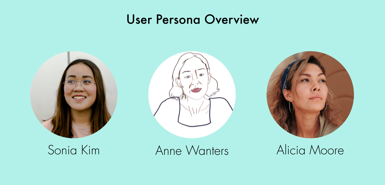
Tentative personas of potential users of the NM History Museum website were created based on the interviews and observations. The personas were created with a hypothetical scenario and not entirely research-based, but helped reflect the website’s typical user demographic.
Key Design Insights
The personas provided key insights to what users care about the NM History Museum website.
Three Insight Themes
Competitive Analysis
Five competitor museum websites were evaluated, and their homepage, navigation, exhibition layout, virtual exhibitions, events/calendar page, and appearance were compared.
Comparing competitor websites allowed the team to pick out the features each website excelled at the most, and learn the following design tips:
Add general visiting information such as hours and tickets on the homepage.
If applicable, add descriptions to main images that are used at the top of pages.
Have a clear, simple, and easy to use navigation system.
Have a simple and clean page layout with effective use of color.
Card Sorting
Three participants were recruited to complete an open card sort test that was created using the Optimal Workshop Tool to analyze the website’s content terminology and categorization. Participants were asked to place 52 different topics into groups, and then label the groups.
Analysis of the test results revealed that the participants found some of the existing terminology confusing, and grouped the topics into fewer categories than on the NM History Museum website’s navigation menu. The wording for those terminology were changed based on the feedback from the participants, and then the topics were grouped into new categories based on the results.
Example Card Sort Test Results
Similarity Matrix
Dendogram
Sitemap
After analyzing the data from the open card sort study and modifying the terminology, the team created a site map that reflected the new and engaging terminology, as well as the condensed amount of topic categories.
Iterative Design Process
Delivery of the Prototype
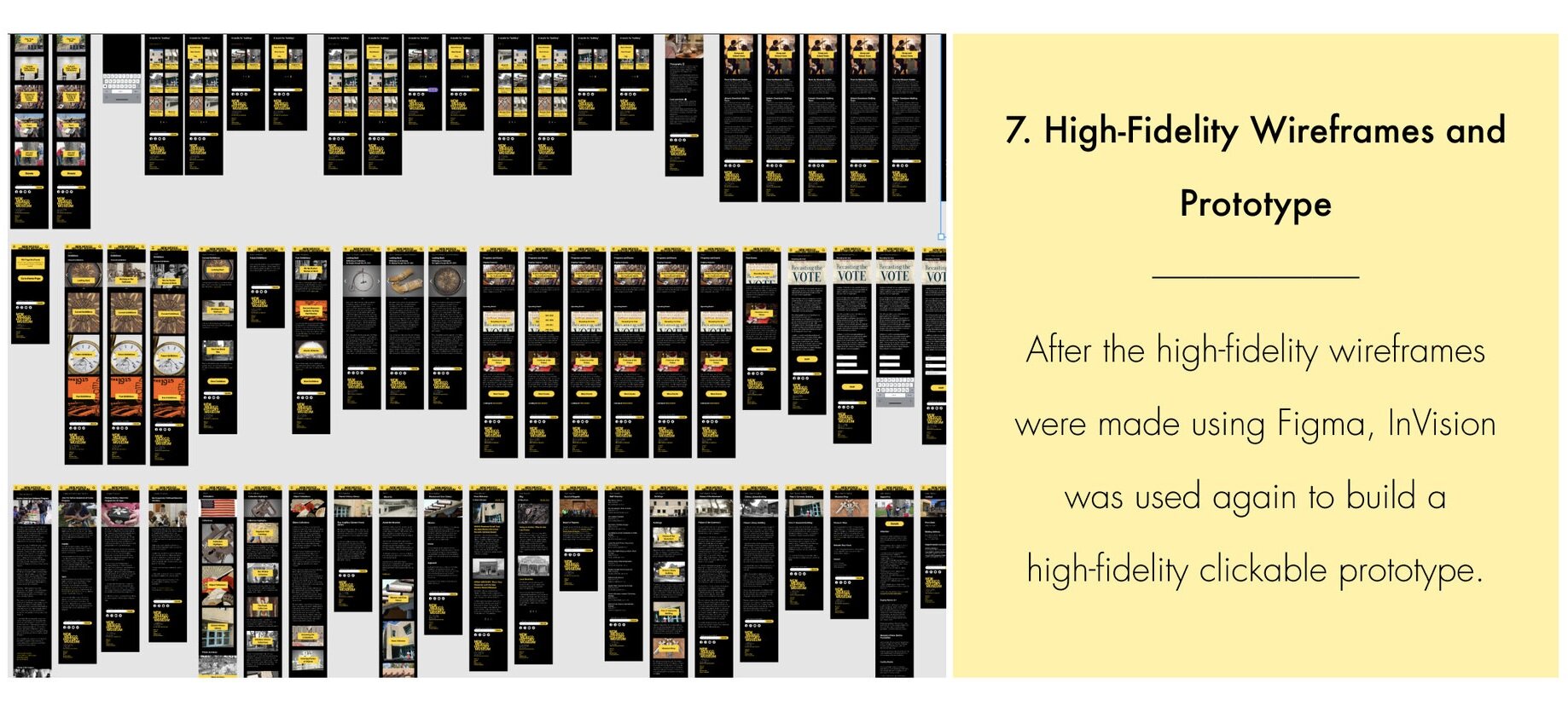
The final high—fidelity clickable prototype for mobile was made with the Figma and InVision tools, and presented to other website redevelopment teams. Fellow researchers described the prototype as having a “bold and attractive” design and typography.
← Play with the prototype.
Conclusion
This project allowed me to practice multiple design and usability research methods commonly used in the industry. Through the teamwork process, I learned how to plan and conduct user interviews, usability tests, and note observations, as well as verify and iterate the design strategy through the feedback of the testings. I was able to provide input in all stages of the project, and ultimately create the final high-fidelity prototype of the New Mexico History Museum website.
Challenges
The main difficulty the team ran into was not fully understanding the needs and branding voice of the New Mexico History Museum, due not being able to meet with the workers of the institution. It would have been ideal if the museum were actual clients, but we were not able to work with them or meet their current users. The lack of input from the museum caused the team to have limited confidence in determining the language and branding tone/voice to include in the site.
The time constraint also limited the number of participants the team was able to recruit, as well as the variety of tests.
Next Steps
A more comprehensive qualitative data can be gathered if additional participants can be recruited to do user interviews, card sorting tests, and usability tests. It would also be helpful to conduct a tree test in the future, as it will help test the new information architecture (IA) proposed after analyzing the data from the open card sort study and modifying the website terminology.
The text on the pages can also be edited in the future to be more simple and concise, as some of the pages remained wordy. Above-the-fold quick links or contextual navigation can be used as a possible solution as well.
The desktop version of the website was also redesigned up to the medium-fidelity level, but creation of the mobile version of the website was prioritized due to time constraint. In the future, the high-fidelity prototype of the desktop website should be completed.


